
Typography
Introduction
Typography is the writing that is presented to the audience you see typography in films during the opening credits and the closing credits at the end. When talking about typography this would include the style of the font, size and lower case. Most of the typography in thrillers are different they maybe different colours to different types of fonts and this would vary from film regardless if it was a sequel to a previous film or not.Typography and connotations (screen shot from various genres)
Horror
__Grudge(1).jpg)
Typography and thrillers: screen shot examples from thrillers and their connotations
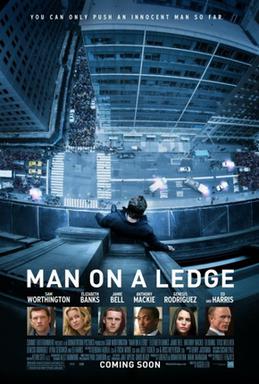
Man on A ledge
Here we can see the use of a simple but effective font. The use of capitals tells us highlight the situation on what's going to happen in the film. The Large font tells us that that scene is quite important.
The Number 23
The font used in the number 23 is split in two parts here. 23 is most importnat part of the typology in the screen shot since its highlight the narrative may have something to do with the number 23. Also the font looks hand drawn and looks kind of werid and odd.
Some analysis of choices that you may consider (include examples)
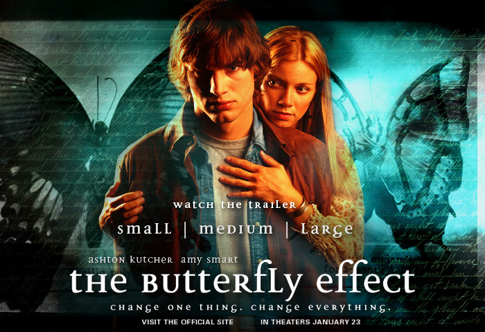 Different thrillers would use different types typography depending on the thriller and theme of the film. An example would be the butterfly effect. Most of the title is a mixture off common words and capitals. However one of the "f" is larger than all the words this could be to highlight what could happen in film to do with the letter.Other thrillers may use may use full capitals to grab the audience attention, And others may use common words only to make the title or credits seem insignificant compared to everything else.
The typography i will use in my film needs to reflect the thriller genre. This means that font, size, letter and case of the letter must be carefully chosen for my thriller the typography i would like to use for my film is a faded type of font also i would also use dark colours reflecting the film it self and the size would be a medium size. I will try to use one font for the opening scene and be consistent with the same use of font.
There is a basic understanding of the purpose and effect of typography used in thrillers. There is a basic range of examples.
ReplyDelete- Please include sub-headings throughout your post.
- Include more typography examples for different film genres.
- For every film example, provide more details about the style of the typography, size and colour, and what each of this connotes.
- One of your images is not showing up, please replace.
- For your analysis, include more detail about the colours and style used, and their impact.
- In your conclusion, include more detail on the typography you want to use in your thriller opening.